
Responsive design is no longer optional. Visitors expect your website to look great on desktops, tablets, and mobile devices, yet creating a truly responsive layout in the default WordPress block editor often requires custom CSS or additional plugins.
That’s exactly why we built Mold Blocks.
Mold Blocks extends the native Gutenberg editor with advanced responsive controls, giving designers and developers the flexibility they need while keeping the editing experience simple and familiar.
Why the Default Block Editor Isn’t Enough
The WordPress block editor has come a long way, but many design settings are still applied universally. In real-world websites, the same layout rarely works perfectly across every screen size.
For example:
- A large heading that looks great on desktop may overwhelm a mobile screen.
- A two-column layout may need to stack differently on tablets.
- Extra padding that improves desktop spacing may waste valuable mobile space.
- Decorative elements might make sense on large screens but should be hidden on smaller devices.
Without responsive controls, achieving these adjustments often means writing custom CSS, creating duplicate blocks, or relying on third-party page builders.
Responsive Controls Built Into Every Block
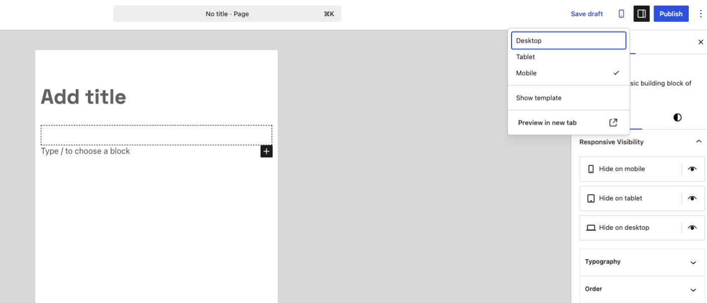
Mold Blocks adds powerful responsive settings directly inside the block editor, allowing you to customize layouts for Desktop, Tablet, and Mobile—without writing code. It have 4 distinctive features
1. Show or Hide Blocks Per Device
Sometimes content should only appear on certain devices.
With Mold Blocks, you can instantly control block visibility:
- Show only on Desktop
- Show only on Tablet
- Show only on Mobile
- Hide on selected devices
This is ideal for:
- Device-specific banners
- Alternative navigation layouts
- Mobile call-to-action sections
- Large illustrations that don’t fit smaller screens
- Desktop-only promotional content
No duplicate pages. No custom CSS.
2. Responsive Typography
Typography should adapt to different screen sizes.
Instead of using one font size everywhere, Mold Blocks lets you define different values for:
- Desktop
- Tablet
- Mobile
For example:
- Desktop: 56px
- Tablet: 42px
- Mobile: 30px
This keeps headings readable while maintaining a balanced layout across all devices.
3. Responsive Padding and Spacing
Spacing has a huge impact on usability.
Mold Blocks lets you adjust padding independently for each viewport, making it easy to:
- Reduce large desktop spacing on phones
- Add breathing room on tablets
- Optimize layouts for every screen size
The result is cleaner, more comfortable reading on every device.
4.Responsive Order Control
Modern layouts often use Flexbox or Grid.
Sometimes the visual order that works on desktop doesn’t make sense on mobile.
With Mold Blocks, you can assign different order values for Desktop, Tablet, and Mobile.
Examples include:
- Displaying an image before text on mobile.
- Moving a call-to-action higher on smaller screens.
- Reordering feature sections without changing the content structure.
Everything happens visually inside the editor—no CSS required.
Save Time and Reduce Custom Code
Traditionally, responsive layouts require media queries such as:
@media (max-width: 768px) {
    .hero-title {
        font-size: 32px;
    }
}
With Mold Blocks, those adjustments are made through intuitive editor controls.
That means:
- Less CSS to maintain
- Faster development
- Easier collaboration with content editors
- Cleaner, more maintainable websites
Designed for Native Gutenberg
Unlike many page builders, Mold Blocks works with the native WordPress block editor.
You keep the advantages of Gutenberg:
- Faster websites
- Cleaner HTML output
- Better long-term compatibility
- Full Site Editing support
- Familiar editing experience
Mold Blocks simply enhances what WordPress already does well.
Perfect for Designers, Agencies, and Developers
Whether you’re building a business website, portfolio, online store, or custom client project, responsive controls help you deliver polished, professional designs without unnecessary complexity.
Instead of fighting with CSS breakpoints, you can focus on creating better user experiences.
Start building websites that look great on every screen—directly inside Gutenberg.
Leave a Reply